Graphic Design for Social Media: 10 Design Principles That Boost Engagement
Master social media graphic design with these 10 principles. Color psychology, typography, composition, platform-specific sizes, and tools for creating visuals that drive engagement.
VidyaSaaS Team
Super Administrator
Meta Description: Master social media graphic design with these 10 principles. Color psychology, typography, composition, platform-specific sizes, and tools for creating visuals that drive engagement.
Introduction
Scroll through your Instagram feed. How many posts do you actually stop to look at? If you're like most people, you pause for maybe one out of twenty. The rest? You scroll right past without a second thought.
That's the brutal reality of social media attention spans. You have about one second to stop someone's thumb. One second to make them look, think, and hopefully engage. For a deeper dive, see Instagram marketing strategy.
And in that one second, your design does all the work.
Not your caption. Not your hashtags. Your visual. The colours, the typography, the composition — these decide whether someone stops or scrolls.
For Indian businesses, this matters more than ever. Your customers are on Instagram, Facebook, LinkedIn, and YouTube. They're scrolling through endless content from competitors, influencers, and brands. If your visuals don't stand out, you're invisible. For a deeper dive, see brand identity guide.
The good news? You don't need to be a professional designer to create social media graphics that work. You need to understand a few core principles and apply them consistently.
These ten principles will transform your social media presence. They apply whether you use Canva, Figma, Photoshop, or any other tool. Learn them, apply them, and watch your engagement grow.
Principle 1: Understand Platform-Specific Requirements
Every social media platform has its own image size requirements, and they change regularly. Using wrong-sized images is the fastest way to look amateur.
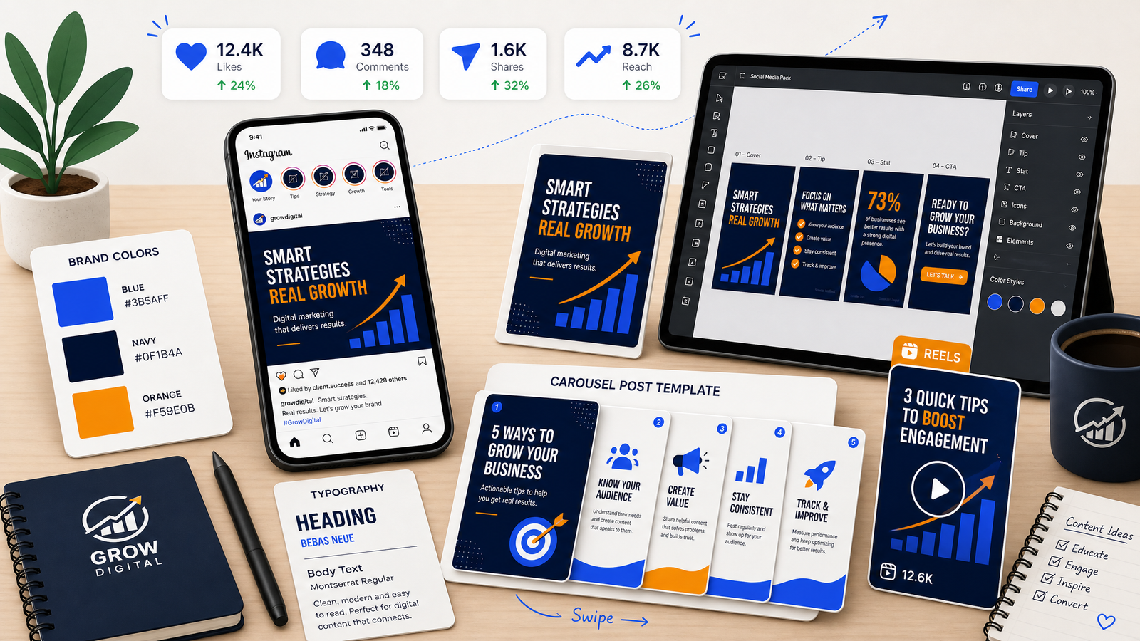
Image Sizes for 2026
Instagram:
- Feed post (square): 1080 x 1080 px
- Feed post (portrait): 1080 x 1350 px (this gets more vertical screen space)
- Feed post (landscape): 1080 x 566 px
- Stories: 1080 x 1920 px
- Reels: 1080 x 1920 px
- Profile picture: 320 x 320 px (shows as a circle)
Facebook:
- Feed post: 1200 x 630 px
- Cover photo: 1200 x 674 px
- Stories: 1080 x 1920 px
- Event cover: 1200 x 628 px
LinkedIn:
- Feed post: 1200 x 627 px
- Cover photo: 1584 x 396 px
- Profile banner: 1200 x 1200 px
- Company page cover: 1128 x 191 px
Twitter/X:
- Feed post: 1600 x 900 px (16:9)
- Header: 1500 x 500 px
- Profile: 400 x 400 px
YouTube:
- Thumbnail: 1280 x 720 px (16:9)
- Channel banner: 2560 x 1440 px
- Channel icon: 800 x 800 px
Why Size Matters
Using wrong dimensions means:
- Images get cropped awkwardly (heads cut off, text missing)
- Quality degrades because the platform resizes your image
- Your content looks unprofessional compared to brands that size correctly
Pro tip: Create templates at the correct size for each platform. Canva and Figma let you save templates. Once set up, you never have to think about sizes again.
Principle 2: Master Colour Psychology for Social
Colours evoke emotions and drive behaviour. Using the right colours for your social media graphics can significantly impact engagement.
How Colour Affects Engagement
- Red: Creates urgency. Great for sales, limited-time offers, and attention-grabbing headlines. Red posts on Instagram get more initial impressions.
- Blue: Builds trust and calm. Works well for B2B brands, professional content, and educational posts.
- Green: Associated with growth, health, nature, and money. Works for finance, wellness, and environmental content.
- Orange: Energetic and warm. Excellent for CTAs, young audiences, and fun content.
- Purple: Luxury, creativity, wisdom. Great for premium brands and creative industries.
- Yellow: Optimism and happiness. Gets attention but can be overwhelming if overused.
- Black and White: Sophistication, minimalism. Works for premium and lifestyle brands.
Using VidyaSaaS Brand Colors
When creating graphics that reference VidyaSaaS or use its aesthetic:
- Primary Blue (#3B5AFF): Use for main elements, backgrounds, trust-building content
- Dark Navy (#0F1B4A): Use for headers, dark mode backgrounds, authoritative content
- Accent Orange (#F59E0B): Use for CTAs, highlights, attention-grabbing elements
Colour Combinations That Work
- High contrast (light text on dark background) increases readability on mobile
- Limited palette (2-3 colours per graphic) looks more professional
- Consistent colours across posts build brand recognition
Tool: Use Coolors.co or Adobe Color to generate complementary colour palettes.
Principle 3: Typography That Stops the Scroll
The fonts you choose communicate personality before anyone reads a single word.
Font Selection Principles
Readability first. Decorative fonts look nice but are hard to read on small screens. On social media, your text must be readable in less than a second.
Limit to two fonts. One for headers, one for body text. Three maximum if you're experienced. More than that looks messy.
Contrast matters. Pair a bold, attention-grabbing font for headlines with a simple, clean font for supporting text.
Size hierarchy:
- Headline: 48px+
- Subhead: 32-40px
- Body: 24-32px
- Caption/disclaimer: 16-20px
On mobile screens viewed at arm's length, smaller text is unreadable. Bigger is always better on social media.
Font Pairings That Work
- Bold sans-serif + light sans-serif (e.g., Montserrat Bold + Open Sans)
- Serif headline + sans-serif body (e.g., Playfair Display + Inter)
- Modern sans-serif + clean sans-serif (e.g., Poppins + Roboto)
Text Over Image
When placing text over images:
- Use a dark overlay (semi-transparent black) behind the text
- Place text on areas of the image that have less detail
- Never put text on busy backgrounds
- Ensure sufficient contrast
Principle 4: Composition and Layout
Good composition guides the viewer's eye through your design. It makes your content feel intentional and professional.
The Rule of Thirds
Divide your canvas into a 3x3 grid. Place your most important elements along these lines or at their intersections. This creates more dynamic, interesting compositions than centering everything.
Visual Hierarchy
Your design should have one focal point — the most important element. Everything else should be secondary. Elements that compete for attention create confusion.
Hierarchy order for most social graphics:
- Main image or illustration
- Headline text
- Logo
- Supporting text
- CTA or link
White Space
White space (or negative space) is not wasted space. It's a design element that improves readability and focus. Don't feel the need to fill every pixel. A clean design with breathing room looks more professional than a cluttered one.
Z-Pattern Layout
In Western reading culture, eyes scan in a Z pattern: top-left to top-right, then down and across. Place your most important elements along this natural scanning path.
Principle 5: Contrast Is King
Contrast makes elements stand out. Without contrast, your message gets lost.
Types of Contrast
Colour contrast: Light vs dark. Complementary colours (opposite on the colour wheel).
Size contrast: Big vs small. The most important text should be the biggest.
Font contrast: Bold vs light. Serif vs sans-serif.
Texture contrast: Simple background vs textured elements.
Shape contrast: Round vs angular. Organic vs geometric.
Why Contrast Matters on Social Media
Social feeds are visually noisy. Your content competes with dozens of other posts. High contrast helps your content punch through the noise.
A common mistake: using a light grey font on a white background. It looks subtle in design software but becomes invisible on phone screens outdoors. Always check your contrast on an actual phone before posting.
Tool: Use WebAIM Contrast Checker to ensure your colour combinations meet accessibility standards.
Principle 6: Carousel Design Best Practices
Carousel posts are the highest-engagement format on Instagram and LinkedIn. They keep people on your content longer, which signals value to the algorithm.
Carousel Structure
Slide 1: The Hook. A compelling headline that makes people swipe. This is the most important slide. Without a good hook, nobody swipes.
Slides 2-4: The Value. Your main content. Break it into digestible chunks. One idea per slide.
Penultimate slide: The Summary. Recap the key points. Reinforce the value.
Last slide: The CTA. What should they do next? Follow, save, share, comment, visit your link.
Carousel Design Tips
- Keep each slide focused on one point
- Use consistent design across all slides
- Number each slide so people know where they are
- Use a consistent colour palette throughout
- Include a branding element (logo, colour) on every slide
- Maintain the same font sizes for consistency
Carousel Size
Instagram carousels work best at 1080 x 1350 px (portrait). This takes up more screen space and feels more immersive.
Principle 7: Reels and Shorts Thumbnail Design
The thumbnail is the first thing people see when your video appears in their feed. It's often more important than the video content itself.
Thumbnail Principles
Face close-ups work. Humans are drawn to faces. A close-up of a person's face with an expressive emotion outperforms almost every other thumbnail type.
Text overlay. Add 2-4 words that explain the value. "5 SEO Tips" — "Budget Guide" — "Don't Do This."
High contrast. Thumbnails need to pop at small sizes on a phone screen.
Brand consistency. Use consistent colours, fonts, and logo placement so your content is recognisable at a glance.
Common Thumbnail Mistakes
- Too much text (unreadable at small sizes)
- Low-quality images (blurry, poorly lit)
- No clear focal point
- Branding so small it's invisible
- Clickbait that doesn't match the video content
Principle 8: Story Design Principles
Stories are temporary, but they're where a huge chunk of social engagement happens.
Story Design Tips
Vertical format always. 1080 x 1920 px. Never horizontal.
Short and punchy. Stories have even less attention than feed posts. One message per story. 3-5 seconds to make your point.
Text visibility. Stories are often viewed in bright environments. Use high contrast. Dark backgrounds with white text are safest.
Stick to brand colours. Even in temporary content, maintain brand consistency.
Use interactive elements. Polls, questions, quizzes, and slider stickers increase engagement and signal the algorithm that people like your content.
Brand slightly. A small logo, a consistent colour, or a font choice. But don't overwhelm the story with branding.
Principle 9: Brand Consistency Across All Visuals
Consistency is the most underrated design principle. It's not exciting, but it works.
Why Consistency Matters
When someone sees your content in their feed, they should recognise it's you within half a second — before they read your username. That's brand recognition.
Consistent visuals build:
- Trust. People feel familiar with your brand.
- Recall. They remember you when they need your service.
- Professionalism. You look like you take your business seriously.
What to Keep Consistent
- Colour palette. Use the same 2-4 colours in every graphic.
- Font choices. Same fonts across all platforms.
- Logo placement. Same position (e.g., bottom-right corner) in every graphic.
- Photo style. Same editing style, colour grading, and composition.
- Iconography. Use a consistent icon style (line icons with consistent stroke width, filled icons, etc.).
Creating Templates
The easiest way to maintain consistency is templates. Create basic layouts for:
- Quote graphics
- Tip posts
- Carousel covers
- Announcements
- Promotional posts
Fill in new content without reinventing the design every time.
Principle 10: A/B Test Your Visuals
Design is subjective, but performance is measurable. Test different approaches to see what your audience actually responds to.
What to Test
Colour schemes. Does your brand blue outperform green CTAs? Test and find out.
Font styles. Playful fonts vs professional fonts — which gets more engagement?
Layouts. Images with text overlay vs text on solid backgrounds.
Photo vs illustration. Stock photos vs illustrated graphics.
Portrait vs square. Instagram portrait (1080x1350) takes more screen space than square (1080x1080). Test which format performs better.
Face vs no face. Posts featuring faces typically get more engagement. Test it for your audience.
How to Test
Post one version on Tuesday, the other on Thursday at the same time. Compare engagement metrics (saves, shares, comments, click-throughs). Keep everything else the same (caption, hashtags, posting time, day of week).
Tools for Testing
- Instagram Insights (native analytics)
- Facebook Creator Studio
- LinkedIn Analytics
- A/B testing for ad visuals in Meta Ads Manager
Tools: When to DIY vs When to Hire
Not every business needs a full-time designer. But not every graphic should be DIY either.
DIY Tools
Canva: Best for non-designers. Thousands of templates. Easy drag-and-drop interface. Pro version costs ₹2,500/year. Covers 90% of social media design needs.
Figma: More powerful but steeper learning curve. Free for basic use. Good for teams. Better for complex designs.
Adobe Express: Free version covers basic needs. Integrates with other Adobe tools. Good for businesses already using Photoshop.
CapCut: For video editing and Reels. Free. TikTok's preferred editing tool. Easy to use.
When to DIY
- Basic quote graphics
- Quick announcements
- Story content
- Simple product posts
- Carousels with text-heavy content
When to Hire a Designer
- Brand identity development
- Complex illustrations
- Premium product photography
- Video production and animation
- Full campaign visual strategy
- Template creation for your team to use
Freelance Rates in India (2026)
- Basic social media posts: ₹500 – ₹1,500 per post
- Carousel design: ₹1,500 – ₹5,000 per carousel
- Brand identity for social media: ₹15,000 – ₹50,000
- Monthly retainer (10-15 posts/week): ₹15,000 – ₹40,000/month
📚 Related Articles You Might Like:
Conclusion
Social media graphic design isn't about being a professional artist. It's about understanding a few core principles and applying them consistently.
Use the right sizes. Choose colours that work for your brand. Make your text readable. Keep your designs clean and focused. Be consistent across every post. And test what works for your specific audience.
The businesses that invest in their social media visuals are the ones that get seen, remembered, and chosen. In a crowded digital India, good design is your competitive advantage.
Need help with your social media graphics? The team at VidyaSaaS creates stunning, brand-consistent social media visuals that drive engagement. From templates to full campaigns, we'll help your brand stand out on every platform. Get in touch for a free consultation.
Want Results Like This?
Get a free digital marketing audit and custom growth plan for your business.
Get Free AuditVidyaSaaS Team
Super AdministratorPart of the VidyaSaaS team — a group of digital marketing strategists, content specialists, and growth experts helping businesses across India achieve measurable results through data-driven marketing.
More about our teamRelated Articles
Handpicked content to help you grow your business
Kalaburagi Heritage to High-Tech: Branding Karnataka Emerging Business Hub Through Digital Marketing
Kalaburagi produces 30% of Karnataka tur dal and hosts major cement plants. But its brand identity i...
Ujjain Mahakal to Modern: Branding MP Spiritual and Industrial City for the Digital Age
Ujjain Mahakal Temple draws millions. Its industrial areas employ thousands. But its brand identity...
Sambalpur Digital Loom: Branding Odisha Handloom Heritage for the Ecommerce Era
Sambalpuri sarees take 3 weeks to weave by hand. But they sell online in 3 minutes when the branding...
Ready to Grow Your Business?
Let's discuss how we can create a data-driven digital marketing strategy tailored to your goals.