Logo Design Trends 2026: What Works for Indian Brands Right Now
Logo design trends in 2026 — minimalism, responsive logos, animated marks, and what's outdated. Plus color psychology for Indian audiences and design costs.
VidyaSaaS Team
Super Administrator
Meta Description: Logo design trends in 2026 — minimalism, responsive logos, animated marks, and what's outdated. Plus color psychology for Indian audiences and design costs.
Introduction
Your logo is the face of your business. It's the visual shorthand that people use to recognise you, remember you, and trust you. And like any face, it needs to feel current without chasing every passing trend.
The problem is, logo design trends shift faster than most business owners realise. What looked fresh in 2022 already feels dated in 2026. The glossy gradients and thick outlines that were everywhere a few years ago? They're yesterday's news. For a deeper dive, see brand identity guide.
But here's the tricky part: you don't want a logo that's trendy today and embarrassing tomorrow. You want a logo that strikes the balance between current and timeless. Modern enough to signal that you're relevant, classic enough to last a decade.
This guide covers the logo design trends that are actually working for Indian brands in 2026. We'll separate the signals from the noise, tell you what's worth adopting, and help you make logo decisions that serve your business for the long haul.
Where Logo Design Is Headed in 2026
Before we dive into specific trends, let's look at the big themes shaping logo design right now. For a deeper dive, see graphic design for social media: 10 design principles t.
Digital-First Thinking
In 2026, most people encounter logos on screens — phones, laptops, tablets, smartwatches. A logo that works at 48 pixels tall matters more than a logo that looks amazing on a billboard. Designers are thinking "small screen first" and scaling up, rather than designing for print and shrinking down.
Brand Systems Over Single Marks
A logo used to be one image. Now it's a system. Brands have primary logos, secondary marks, icons, favicons, animated versions, and social media avatars that all relate to each other but serve different purposes. The single logo file you had in 2015 won't cut it in 2026.
Purposeful Simplicity
The "minimalist trend" isn't a trend anymore — it's the default. Overly complex logos with multiple colours, gradients, and intricate details feel outdated. Simple, clean, purposeful marks communicate confidence and clarity. For a deeper dive, see brand identity guide.
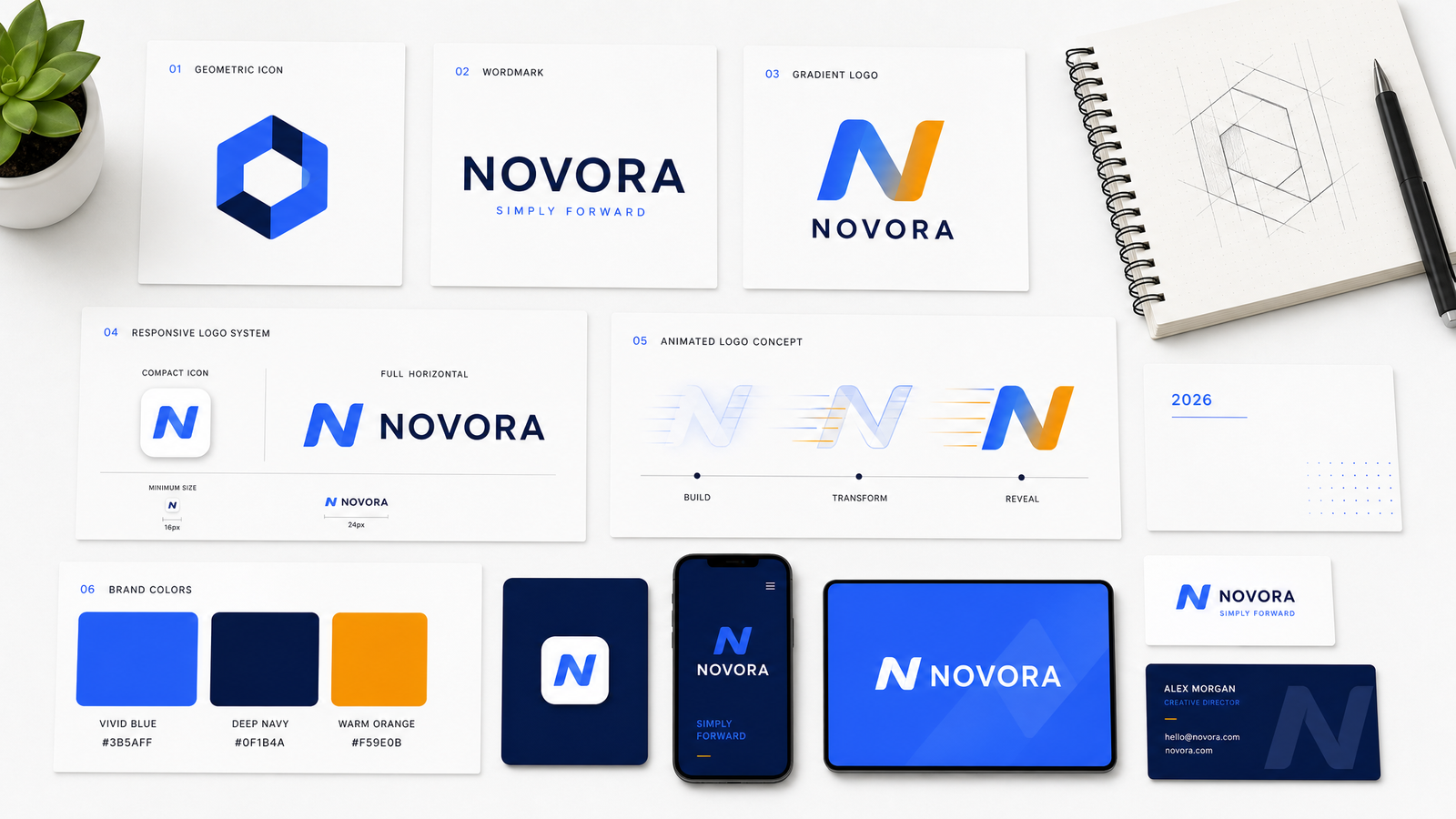
Trend 1: Extreme Minimalism (Still Going Strong)
Minimalism in logo design isn't new. But in 2026, it's reached a point where brands are stripping away everything non-essential.
What It Looks Like
- Single-colour logos
- Simple geometric shapes
- Ample negative space
- No unnecessary lines, strokes, or decorations
- Sans-serif wordmarks with clean letter spacing
Why It Works
A minimal logo is more versatile. It scales down to a tiny app icon without losing detail. It works in one colour for embroidery, embossing, or single-colour printing. It communicates confidence — you don't need visual tricks to be memorable.
Indian Brands Doing It Well
- CRED — Their logo is essentially typography with a simple icon. Clean, confident, distinctive.
- Zerodha — A simple wordmark. No icon needed. The typography carries the brand.
- Groww — Simple, bold lettering with a distinctive partial underline.
Caution
Extreme minimalism can backfire if you go too far. A logo that's so stripped down it looks generic fails at its primary job: being recognisable. The goal is simplicity with personality, not simplicity for its own sake.
Trend 2: Responsive and Adaptive Logos
A responsive logo changes its form based on where it's displayed. The full version might appear on your website header. A simplified icon version appears on your favicon. A horizontal version fits social media banners.
Why This Matters for Indian Brands
In India, your logo appears on:
- Your website (desktop and mobile)
- Instagram, LinkedIn, Facebook, YouTube
- WhatsApp Business
- Google My Business listing
- Email signatures
- Print materials (business cards, brochures, packaging)
- App icons (if you have one)
- Signage (if you have a physical location)
A single logo file can't work well in all these places. The full logo might look great on your website but be illegible as an Instagram avatar.
What You Need
A responsive logo system typically includes:
- Primary logo: Full logo for most uses
- Icon only: The symbol without text (for app icons, favicons)
- Horizontal version: Side-by-side layout (for website headers)
- Stacked version: Icon above text (for vertical spaces)
- Minimum size version: Simplified for very small spaces
Trend 3: Variable Fonts in Logo Design
Variable fonts are a single font file that can adjust weight, width, slant, and other attributes. In logo design, this opens up possibilities that weren't available before.
What It Enables
- A logo wordmark that dynamically adjusts for different screen sizes
- Animated weight transitions (the text gets bolder on hover)
- Responsive typography that changes character based on context
- A more distinctive typographic identity
Why It's Trending
As more brand experiences move to digital, variable fonts give designers tools to make logos feel alive and responsive without adding complexity.
Implementation Considerations
Variable fonts work best for wordmark logos (logos made entirely of text). For combination marks (icon + text), the variable font typically applies to the text portion. Not every brand needs this, but for digital-native brands, it's a differentiator.
Trend 4: Gradient Logos (Done Subtly)
Gradients fell out of favour for a while because they were associated with the over-the-top glossy designs of the early 2010s. But gradients are back in 2026 — used differently this time.
The New Gradient Approach
- Subtle, not flashy
- Two tones, not multi-colour rainbows
- Often used within geometric shapes
- Applied with restraint, not covering the entire logo
Why It Works for Indian Brands
Gradients add depth and a premium feel. For brands in fashion, beauty, tech, and lifestyle, a carefully applied gradient can communicate sophistication without looking dated.
When to Skip Gradients
If your brand appears mostly in print, on packaging, or in one-colour environments (embroidery, embossing, signage), a gradient adds complexity without benefit. Stick with solid colours.
Trend 5: Animated and Motion Logos
Animation in logos isn't new for video introductions or TV commercials. But in 2026, animated logos are becoming standard for websites and social media.
Types of Logo Animation
- Reveal animation: The logo builds itself (lines draw, shapes appear, text fades in)
- Hover animation: The logo responds when you hover over it (colour change, slight movement)
- Loop animation: A subtle continuous animation (gentle pulsing, floating, rotating)
- Transition animation: The logo transforms between its icon and full versions
Why It Matters
Motion captures attention. On a website, a subtle logo animation signals that you're modern and technically competent. On social media, an animated logo makes your brand videos feel more produced without extra work.
Implementation Tips
- Keep it subtle. Aggressive animations feel amateur.
- Make sure the final static state is strong. Not everyone will see the animation.
- Provide a static fallback for environments that don't support animation (email signatures, PDFs).
Trend 6: Cultural and Regional Design Elements
Indian brands are increasingly incorporating regional design elements into their logos. This isn't about putting a traditional motif on everything — it's about thoughtful integration of cultural references.
What This Looks Like
- Traditional Indian patterns simplified into modern geometric forms
- Devanagari or other Indian script integrated into the design
- Colour choices inspired by Indian art and textiles
- Symbols from Indian iconography used tastefully
Caution
Cultural elements can look forced if not done by a designer who understands the context. Avoid stereotypes and clichés (the Taj Mahal silhouette, dancing figures, etc.). The reference should serve the brand, not be the entire point of the logo.
What's Outdated in 2026
Some design approaches are better left in the past.
1. "Out of the Box" Logo Shapes
Generic templates that come with logo maker tools. The swoosh. The abstract stars. The globe with lines. These shapes tell customers nothing about your business and make you look like a template user.
2. Extreme Skeuomorphism
Logos that try to look 3D with drop shadows, bevels, and glossy highlights. This was popular in the early 2010s. In 2026, it looks dated.
3. Clip Art Style Icons
Using a generic clip art image as your logo. A handshake, a house, a phone. These communicate "I didn't invest in my business."
4. Too Many Colours
Logos with four or more colours are harder to reproduce and less versatile. Most strong logos use 1-3 colours maximum.
5. Trendy Fonts
Script fonts that are popular this year but will look dated next year. Or fonts that are so recognisable (like Lobster, Pacifico, or any Comic Sans variant) that they signal amateur design.
6. Overly Complex Details
Fine lines, tiny text, intricate patterns that disappear when the logo is scaled down. If your logo doesn't work at 50px, it's too complex.
Colour Psychology in Logo Design for Indian Audiences
Colours carry meaning. But that meaning shifts based on culture and context.
What Colours Mean in India
Blue: Trust, stability, professionalism. Used by banks, tech companies, and B2B brands.
Red: Energy, passion, auspiciousness. Red is positive in Indian culture — associated with weddings, festivals, and celebration.
Green: Growth, nature, fertility. Also associated with Islam. Used by organic brands, finance, and agricultural products.
Orange: Warmth, creativity, spirituality. Sacred colour in Hinduism. Used by startups, education, and spiritual brands.
Yellow: Optimism, energy, attention-grabbing. Used by food brands and children's products.
Purple: Luxury, wisdom, premium. Used by premium brands and beauty products.
Black: Power, sophistication, luxury. Used by luxury brands and premium products.
White: Purity, cleanliness, simplicity. Used by healthcare, wellness, and minimalist brands.
Practical Considerations
- Make sure colour combinations have good contrast for readability
- Test your logo in black and white
- Consider how colours look on mobile screens
- Get feedback from your target audience
Industry-Specific Logo Considerations
Different industries have different expectations.
Technology and SaaS
Clean, modern sans-serif wordmarks. Abstract geometric icons. Blue or dark colour schemes. Responsive and animated versions expected.
Food and Beverage
Warm colours (red, orange, yellow). Friendly typography. Icons of food items. Works on packaging and signage.
Healthcare
Blue or green colour schemes. Clean, trustworthy typography. Icons that suggest care. Avoid clinical or cold looks.
Education
Warm, welcoming colours. Readable typography. Icons related to knowledge. Works across print and digital.
Fashion and Lifestyle
Premium serif or custom typography. Minimal iconography. Black, white, gold, or muted colours. Must work on tags and packaging.
AI Logo Makers vs Professional Designers
AI logo tools have improved dramatically. But they're not a replacement for professionals.
What AI Does Well
- Generates ideas quickly
- Creates decent starting points on small budgets
- Helps explore directions visually
- Useful for MVPs and personal brands
Where AI Falls Short
- Not legally original — same system can generate similar logos for competitors
- Doesn't understand your strategy, audience, or positioning
- Often generic because based on popular logo patterns
- No colour psychology, cultural sensitivity, or long-term application input
The Middle Path
Use AI tools for inspiration. Then hire a professional to refine and finalize. Speed of AI with strategy of a professional.
Logo Design Cost in India (2026)
| Service | Budget | Mid-Range | Premium | |---------|--------|-----------|---------| | DIY AI tool | ₹0 – ₹5,000 | — | — | | Indian freelancer | ₹10,000 – ₹25,000 | ₹25,000 – ₹50,000 | ₹50,000+ | | Design agency | ₹25,000 – ₹50,000 | ₹50,000 – ₹1,50,000 | ₹1,50,000+ |
- Budget: Basic logo, limited revisions, template-based
- Mid-Range: Custom design, multiple concepts, revision rounds, multiple formats
- Premium: Full brand strategy, custom typography, complete logo system, guidelines
How to Choose a Timeless vs Trendy Logo
The best logos balance current appeal with lasting power.
Timeless Elements
- Simple, clean shapes
- Good typography
- Strong contrast
- Works in one colour
- Scalable
- Appropriate for industry
Trendy Elements (Use with Caution)
- Specific colour gradients
- Popular animation styles
- Fonts that are everywhere
- Design motifs from pop culture
The Test
Ask yourself:
- Will this look good in 5 years? 10 years?
- If every competitor went a different direction, would ours still work?
- Does it represent our business, or is it just "cool right now"?
If the answer to any is "maybe not," reconsider.
📚 Related Articles You Might Like:
Conclusion
Logo design in 2026 is about simplicity, versatility, and digital-first thinking. Clean minimal marks, responsive logo systems, and thoughtful cultural references are what set strong brands apart.
But trends are guidelines, not rules. The best logo for your business fits your brand strategy, resonates with your audience, and works across every touchpoint.
At VidyaSaaS, we design logos as part of complete brand identity systems. We don't just give you a mark — we give you the strategy behind it, the variations you need, and the guidelines to use it consistently.
Need a logo that works for your Indian business? The VidyaSaaS team in Bhopal designs custom logos and full brand identity systems for businesses across India. Get in touch for a free logo design consultation.
Want Results Like This?
Get a free digital marketing audit and custom growth plan for your business.
Get Free AuditVidyaSaaS Team
Super AdministratorPart of the VidyaSaaS team — a group of digital marketing strategists, content specialists, and growth experts helping businesses across India achieve measurable results through data-driven marketing.
More about our teamRelated Articles
Handpicked content to help you grow your business
Kalaburagi Heritage to High-Tech: Branding Karnataka Emerging Business Hub Through Digital Marketing
Kalaburagi produces 30% of Karnataka tur dal and hosts major cement plants. But its brand identity i...
Ujjain Mahakal to Modern: Branding MP Spiritual and Industrial City for the Digital Age
Ujjain Mahakal Temple draws millions. Its industrial areas employ thousands. But its brand identity...
Sambalpur Digital Loom: Branding Odisha Handloom Heritage for the Ecommerce Era
Sambalpuri sarees take 3 weeks to weave by hand. But they sell online in 3 minutes when the branding...
Ready to Grow Your Business?
Let's discuss how we can create a data-driven digital marketing strategy tailored to your goals.