Why Your Website Needs to Be Mobile-Friendly: Google Mobile-First Indexing Explained
Google now ranks websites based on mobile versions first. Learn what mobile-first indexing means for Indian businesses and how to make your site mobile-friendly.
VidyaSaaS Team
Super Administrator
Meta Description: Google now ranks websites based on mobile versions first. Learn what mobile-first indexing means for Indian businesses and how to make your site mobile-friendly.
Introduction
Here's a number that should stop you in your tracks: 76% of internet users in India access the web exclusively through their phones. Not sometimes. Not mostly. Exclusively.
Think about that. When someone in Pune searches for "best salon near me" or a business owner in Lucknow looks up "digital marketing agency in Bhopal," they're almost certainly doing it on a phone. Not a laptop, not a desktop. A phone with a six-inch screen and possibly slow mobile data. For a deeper dive, see technical SEO checklist.
Now here's the question: when that person lands on your website, what do they see? A beautifully designed desktop site shrunk down to fit a phone screen, with buttons too small to tap and text that requires pinch-to-zoom? Or a properly mobile-optimised experience that loads in two seconds and looks like it was made for their device?
If your answer is the first one, you have a problem. A big one. Because Google now primarily uses the mobile version of your website to rank you. Not the desktop version. The mobile version.
This isn't a prediction or a trend. It's Google's standard since 2021. Mobile-first indexing is the default. And if your website isn't mobile-friendly, you're not just losing customers — you're losing search rankings too. For a deeper dive, see conversion rate optimization.
In this guide, we'll break down what mobile-first indexing actually means, why it matters more for Indian businesses than anyone else, and exactly how to make your website mobile-friendly. No jargon. No theory. Just actionable advice.
What Is Mobile-First Indexing?
Let's start with the basics. Before mobile-first indexing, Google's algorithm looked at the desktop version of your website to determine where you should rank. It would crawl your desktop site, analyse the content, check the links, and assign rankings accordingly.
That made sense in 2010 when most people browsed the web on desktops. For a deeper dive, see lead generation tactics.
But the world changed. By 2016, more Google searches happened on mobile than on desktop. Google realised they were judging websites based on a version that fewer and fewer people were actually seeing. So they flipped the script.
Mobile-first indexing means Google now primarily uses the mobile version of your website for indexing and ranking. It crawls your mobile site, evaluates its content, and decides where you rank based on what mobile users will see.
The "first" in mobile-first is important. It doesn't mean Google ignores your desktop site. It means the mobile version is the starting point, the primary reference. If your mobile site has less content than your desktop site, if key information is missing, if the mobile experience is poor — that's what Google will use to judge you.
The Timeline
- 2016: Google announced they were experimenting with mobile-first indexing
- 2018-2019: Gradual rollout, site by site
- 2021 (March): Google enabled mobile-first indexing for all new websites
- 2023 (October): Google completed the switch — all websites are now mobile-first indexed
There's no opting out. No desktop-only loophole. Every single website on Google is now evaluated through a mobile lens.
What This Means for Indian Businesses
This matters more in India than almost anywhere else. Here's why.
India has one of the highest mobile-first internet populations in the world. While Western countries have a more balanced desktop-mobile split, Indian users overwhelmingly prefer mobile. Jio's affordable data plans put smartphones in the hands of hundreds of millions of people who never owned a desktop computer.
For a local business in Indore or a startup in Bangalore, your entire online audience is mobile. If your website works well on desktop but poorly on mobile, you're invisible to most of your potential customers — and Google has confirmed that your desktop optimisations do little to help your mobile rankings.
Responsive vs Adaptive vs Separate Mobile Site
When people talk about mobile-friendly websites, they usually mean one of three approaches. Let's clear up the confusion.
Responsive Design
This is the gold standard. A responsive website uses flexible layouts, fluid grids, and CSS media queries to adapt to any screen size. The same HTML and content automatically rearrange themselves to fit the device.
How it works: You build one website. The design changes based on the screen width. On a desktop, you see three columns. On a phone, those columns stack vertically. Images resize. Fonts adjust. Navigation collapses into a hamburger menu.
Pros:
- One URL for all devices (no SEO confusion)
- Single set of content to manage
- Google recommends this approach
- Works for any future screen size
Cons:
- Requires skilled design and development
- Can be heavy if not optimised properly
- Some complex desktop layouts are hard to translate to mobile
Adaptive Design
Adaptive design uses multiple fixed layout sizes. Your website detects the device and serves a pre-designed layout for that screen size. Typical breakpoints are mobile (320px), tablet (768px), and desktop (1024px+).
How it works: Instead of one fluid layout that adjusts continuously, you have three distinct designs. When a user visits from an iPhone, they get the mobile layout. From an iPad, the tablet layout. The server or browser picks the right one.
Pros:
- More control over each device experience
- Can optimise specifically for mobile without affecting desktop
- Works well when mobile and desktop needs are very different
Cons:
- More maintenance (you're managing multiple layouts)
- New devices may not fit your predefined breakpoints
- Less future-proof than responsive
Separate Mobile Site (m.domain.com)
This is the old approach. You have your main site at www.yourdomain.com and a stripped-down mobile version at m.yourdomain.com.
How it works: When Google detects a mobile user, it redirects them to the m-dot version. The mobile site has different URLs, different content, and often much less functionality.
Pros:
- Complete control over mobile experience
- Can make mobile site very lightweight
- Independent of desktop development
Cons:
- SEO nightmare — two sets of URLs to manage
- Must maintain canonical tags and redirects perfectly
- Content duplication issues
- Users can't easily switch between mobile and desktop views
- Google considers this outdated
Our recommendation: Go responsive. It's what Google recommends, it's what users expect, and it's the most maintainable approach for the long term. At VidyaSaaS, every website we build is responsive by default — not as an add-on feature.
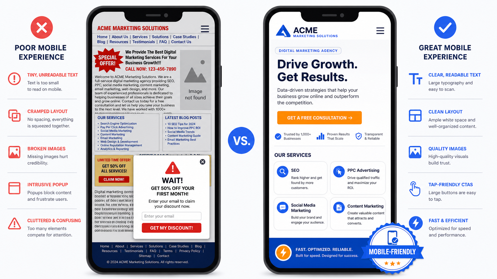
Mobile UX Best Practices
Making a website mobile-friendly is about more than just shrinking things down. It's about rethinking the entire experience for a small screen, touch interaction, and often an impatient user.
Thumb-Friendly Design
Most people hold their phone with one hand and navigate with their thumb. Research shows that the most comfortable zone for thumb interaction is the middle and bottom of the screen. The top corners (where many websites put their CTAs) are the hardest to reach.
What to do:
- Put primary actions (CTAs, buttons) in the middle or bottom third of the screen
- Keep navigation elements within easy thumb reach
- Don't place critical buttons in the top-left or top-right corners
- Use bottom navigation bars for key actions
Touch Targets
Your desktop users have a mouse with pixel-perfect precision. Your mobile users have thumbs. Big difference.
Apple's Human Interface Guidelines recommend a minimum tap target of 44x44 pixels. Google's Material Design says 48x48 pixels. Either way, your buttons need to be bigger than you think.
Common mobile tap mistakes:
- Links that are too close together (users tap the wrong one)
- Small close buttons on popups (users can't escape)
- Checkboxes and radio buttons the size of a pea
- Dropdown menus that require precise tapping
If a user has to zoom in to tap something, your design has failed.
Typography on Mobile
Reading on a small screen is harder on the eyes. Make it easy.
- Body text: Minimum 16px. Anything smaller and users will zoom.
- Line height: 1.5x the font size. Tight text is hard to read on mobile.
- Line length: 50-75 characters per line. Longer lines force the eye to scan too far.
- Contrast: Higher contrast is better on mobile, especially outdoors in sunlight.
Forms on Mobile
Filling out a form on a phone is painful. Make it less so.
- Use the correct input type —
type="tel"for phone,type="email"for email — so the right keyboard appears - Auto-capitalisation should be off for email and URL fields
- Show labels above fields (placeholder text disappears once you start typing)
- Use large form fields — at least 48px tall
- Minimise required fields. Ask for the minimum to start the conversation
Navigation
Desktop navigation with dropdown menus doesn't work on mobile. You need a different approach.
- Hamburger menus are standard, but test if your audience knows what the three lines mean. Some older demographics don't.
- Bottom tab bars for primary navigation are increasingly popular and more thumb-friendly.
- Sticky headers with a CTA button can significantly improve conversion on mobile.
- Breadcrumbs help users understand where they are since mobile screens show less context.
Page Speed on Mobile
Mobile speed isn't a nice-to-have. It's a ranking factor and a conversion killer.
The Mobile Speed Reality in India
Internet speeds in India have improved dramatically, but they're not uniform. A user in Mumbai on Jio 5G has a very different experience from a user in a small town on 4G with patchy coverage.
Your website needs to work for both.
What Affects Mobile Speed
Images. Large, uncompressed images are the #1 cause of slow mobile sites. A single hero image at 3000px wide can take seconds to load on 4G.
JavaScript. Heavy JavaScript frameworks, unnecessary animations, and bloated libraries kill mobile performance. Every script blocks rendering.
Custom fonts. Each custom font you add is another HTTP request and file download. Stick to one or two font families.
Third-party scripts. Analytics, chat widgets, tracking pixels, ad scripts — each one is a potential speed bomb. Audit what you actually need.
Tools to Test Mobile Speed
- Google PageSpeed Insights — The gold standard. Gives you specific, actionable recommendations for improvement.
- Lighthouse (Chrome DevTools) — Built into Chrome. Tests performance, accessibility, SEO, and more.
- GTmetrix — Good for detailed waterfall analysis of what's slowing your site.
- WebPageTest — Most detailed. Lets you test from different locations and devices.
Realistic Mobile Speed Targets
| Metric | Good | Needs Work | Poor | |--------|------|------------|------| | First Contentful Paint | <1.5s | 2.5s+ | 4s+ | | Time to Interactive | <3s | 5s+ | 8s+ | | Largest Contentful Paint | <2.5s | 4s+ | 6s+ | | Cumulative Layout Shift | <0.1 | 0.25+ | 0.5+ |
Chase these numbers. Every second you shave off load time translates to higher conversions.
Mobile-First Content Considerations
The desktop version of your site might have years of accumulated content. But not all of it translates well to mobile.
Content Hierarchy
On a large desktop screen, you can present multiple content blocks and let the user's eyes wander. On mobile, you need a clear, linear hierarchy. The user scrolls through content in a single column. They can't easily glance at sidebars or secondary sections.
This means:
- Your most important content must come first
- Secondary content should be lower or hidden behind expandable sections
- Sidebar content needs to be integrated into the main column or placed after the primary content
- Don't bury your CTA below five screens of scrolling
Accordion and Expandable Sections
Long pages are harder on mobile. Break up content into expandable sections (accordions) where users can tap to reveal more information. This keeps the page manageable while still providing depth.
Good use cases for accordion:
- FAQ sections
- Product specifications
- Service details
- Terms and conditions
Bad use case:
- Your main service description (keep this visible)
- Pricing tables (users need to compare)
Video on Mobile
Video is powerful on mobile. But autoplaying video with sound will drive users away. Always:
- Never autoplay with sound
- Show video controls clearly
- Use a compelling thumbnail that makes people want to tap play
- Consider mobile data costs — offer a text alternative
How to Test Your Site's Mobile-Friendliness
You don't need to guess whether your site is mobile-friendly. Google gives you free tools to check.
Google's Mobile-Friendly Test
Go to https://search.google.com/test/mobile-friendly. Enter your URL. Google will analyse your page and tell you:
- Is it mobile-friendly? (Yes/No)
- If no, what specific issues are there? (Text too small, clickable elements too close, viewport not set, content wider than screen)
- A screenshot of how your page looks on mobile
Manual Testing: 10-Minute Audit
You can also do your own quick audit. Open your website on an actual phone. Go through this checklist:
- Load time — Does the page load within 3 seconds? Time it.
- Readability — Can you read the text without zooming?
- Tap test — Can you tap all buttons and links without accidentally hitting the wrong one?
- Form filling — Try filling out the contact form. Is it painful?
- Navigation — Can you find what you need in 2 taps?
- Scrolling — Does the page scroll smoothly? Any jarring layout shifts?
- Images — Do images look good without being pixelated?
- Popups — Any intrusive popups that cover the content? Google penalises these on mobile.
- Zoom — Does pinch-zoom work? (It should — don't disable it)
- Orientation — Does the site work in both portrait and landscape?
If you fail on 3 or more of these, your mobile experience needs work.
Common Mobile Website Mistakes Indian Businesses Make
After building hundreds of websites, here are the most common mobile mistakes we see:
1. Popups That Cover Everything
Nothing makes a mobile user bounce faster than landing on a page and immediately seeing a full-screen popup that's impossible to close because the X button is too small. Google actually penalises intrusive interstitials — popups that cover the main content and force users to dismiss them before seeing the page.
Fix: If you must use a popup, make it a small, dismissable banner, not a full-screen overlay. Or time it to appear after the user has been on the page for a few seconds.
2. Disabled Zoom
Some websites add user-scalable=no to the viewport meta tag, preventing users from pinching to zoom. This is terrible for accessibility. Never disable zoom on mobile.
3. Text That Requires Pinch-to-Zoom
If your mobile font size is 12px or smaller, you're forcing users to zoom in to read. Increase it.
4. Horizontal Scrolling
If your content extends beyond the screen width and forces horizontal scrolling, users will leave. This usually happens because of:
- Images that aren't sized properly
- Tables that don't wrap
- Fixed-width elements on a fluid layout
5. Unplayable Videos
Videos that won't play on mobile because of unsupported formats or missing controls. Test every video on an actual phone.
6. Missing Click-to-Call
If you're a local business and your phone number isn't a tappable link, you're losing easy leads. Use tel: links. A user should be able to tap your number and immediately call you.
7. Slow Slow Slow
Let us say it again: speed is everything on mobile. If your mobile site takes more than five seconds to load, more than 50% of visitors will leave before seeing anything.
How Mobile-Friendliness Affects SEO
Let's connect the dots between mobile design and search rankings.
Direct Ranking Impact
Mobile-friendliness is a confirmed Google ranking factor. Google announced this in 2015 with "Mobilegeddon" — an algorithm update that boosted mobile-friendly pages in mobile search results.
Since then, it's only become more important. Sites that aren't mobile-friendly simply rank lower for mobile searches.
Indirect SEO Impact
Mobile-friendliness affects SEO in ways beyond the direct ranking factor:
- Bounce rate: A poor mobile experience increases bounce rate. Google interprets high bounce rates as a signal that your content isn't what users want.
- Time on site: If your mobile experience frustrates users, they spend less time on your site. Lower engagement signals to Google that your content is less valuable.
- Page speed: Google's Core Web Vitals include loading performance, interactivity, and visual stability — all of which are heavily influenced by mobile optimisation.
- Crawl budget: Google crawls your mobile version. If your mobile page is slow or poorly structured, Google may crawl fewer pages on your site.
Mobile vs Desktop Conversion Data from India
Numbers speak louder than theory. Here's what Indian businesses typically see:
| Metric | Desktop Users | Mobile Users | |--------|--------------|--------------| | Share of traffic | 25-35% | 65-75% | | Average bounce rate | 35-45% | 50-70% | | Average session duration | 3-5 minutes | 1.5-3 minutes | | Conversion rate | 3-5% | 1-3% |
The mobile conversion gap exists, but it narrows significantly when websites are properly optimised for mobile. Businesses that invest in mobile UX often see mobile conversion rates rise from 1% to 3-4%.
📚 Related Articles You Might Like:
Conclusion
Mobile-first indexing isn't coming — it's already here. Google fully switched over, and every website is now ranked based on its mobile version. If your Indian business website isn't mobile-friendly, you're losing rankings, traffic, and sales.
The fix isn't complicated, but it does require intention. Responsive design, fast loading, thumb-friendly navigation, and content that works on a small screen. These aren't optional extras — they're the baseline.
Think about it this way: three out of four potential customers in India will first encounter your business on a phone. Their experience on that small screen will determine whether they stay, explore, and contact you, or whether they bounce to a competitor whose mobile site actually works.
Which impression do you want to leave?
Is your website mobile-friendly? Find out with a free mobile audit from VidyaSaaS. Our team in Bhopal will test your site on mobile, identify issues, and give you a clear plan to fix them. With 2,000+ websites built and optimised, we know what works on Indian mobile users. Get your free mobile audit today.
Want Results Like This?
Get a free digital marketing audit and custom growth plan for your business.
Get Free AuditVidyaSaaS Team
Super AdministratorPart of the VidyaSaaS team — a group of digital marketing strategists, content specialists, and growth experts helping businesses across India achieve measurable results through data-driven marketing.
More about our teamRelated Articles
Handpicked content to help you grow your business

Solapur Textile Town 2.0: Web Design and Digital Presence for Maharashtra Manufacturing Hub
Solapur towels and bed sheets supply hotels across India. Its textile mills run 24/7. But its websit...

Bhavnagar Port City Potential: Web Design and Digital Presence for Gujarat Diamond and Ship-Breaking Hub
Bhavnagar diamond polishers supply global markets. Alang ship-breakers recycle the world vessels. Bu...

Erode Turmeric to Textiles: Web Design That Sells for Tamil Nadu Agricultural Powerhouse
Erode turmeric sells in 40 countries. Its textile mills supply global brands. But most businesses he...
Ready to Grow Your Business?
Let's discuss how we can create a data-driven digital marketing strategy tailored to your goals.