Business Website Design Guide: How to Build a Website That Converts Visitors Into Leads
Learn how to design a business website that actually brings in leads. Conversion-focused design, UX principles, mobile-first approach, and practical tips for Indian businesses.
VidyaSaaS Team
Super Administrator
Meta Description: Learn how to design a business website that actually brings in leads. Conversion-focused design, UX principles, mobile-first approach, and practical tips for Indian businesses.
Introduction
Let's be honest for a second. How many business websites have you visited that looked pretty but left you completely confused about what to do next? The kind where you land on the homepage and spend fifteen seconds hunting for a phone number, another thirty seconds trying to figure out what the company actually does, and then you just leave.
That's not just a bad experience. That's lost money. For a deeper dive, see conversion rate optimization.
Here's the truth most business owners in India don't hear: Your website is not a brochure. It's not a digital business card. It's not something you tick off a checklist and forget about. Your website is your hardest-working salesperson. It works 24/7, never takes a chai break, and talks to more potential customers in a single day than your entire sales team will meet in a week.
But here's the catch. That salesperson only works if you design it right.
At VidyaSaaS, we've built and redesigned hundreds of business websites over the past seven years. We've seen what works and what absolutely doesn't. And the biggest mistake we see Indian businesses make? Treating website design as a creative exercise instead of a conversion machine. For a deeper dive, see why your website needs to be mobile-friendly: google mo.
This guide will walk you through everything you need to build a website that doesn't just look good but actually brings in leads. From user experience principles to mobile-first design, from trust signals to crafting the perfect call-to-action. No fluff. No buzzwords. Just practical, actionable advice.
Why Most Business Websites Fail at Converting Visitors
Before we get into the "how," let's talk about the "why not." Why do most business websites in India fail to convert?
They're built for the owner, not the customer.
Walk into any small business meeting about a new website and here's what you'll hear: "I want it to look premium." "Make sure the logo is big." "I like blue." Rarely do you hear: "What does our customer actually need to see first?"
The problem is ego-driven design. Business owners want a website that impresses their competitors or looks like their favourite international brand. But your website isn't for you. It's for a person who has a problem and is looking for a solution. They don't care about your design preferences. They care about whether you can solve their problem.
Too many choices, zero direction.
This is called the paradox of choice, and it kills conversions. When a visitor lands on your homepage and sees five different menu options, a popup, a slider, three buttons, and a chat widget, their brain freezes. They don't know where to click. So they don't click anywhere. They leave.
The best websites tell visitors exactly what to do. One primary action per page. Everything else is secondary or hidden.
Slow loading speed.
This one hurts. Indian websites are notoriously slow. And in a country where a huge chunk of your audience is on mobile data, speed isn't a luxury — it's a necessity. Google's own data shows that as page load time goes from one second to three seconds, the probability of bounce increases by 32%. At five seconds, it's 90%.
If your website takes more than three seconds to load, half your visitors are gone before they've seen anything.
No trust signals.
Indian consumers are skeptical. They've been burned by bad products, fake reviews, and shady businesses. If your website doesn't immediately signal that you're trustworthy — through testimonials, case studies, client logos, certifications, or clear contact information — they won't convert. They'll go find someone who looks more credible.
User Experience Principles Every Business Website Needs
User experience, or UX, is just a fancy way of saying "make it easy for people to use your website." It's not complicated. It doesn't require a psychology degree. It requires empathy.
Know What Your Visitor Wants Before They Do
When someone lands on your site, they're in one of three states:
- I know exactly what I want — They're searching for a specific service or product.
- I know my problem but not the solution — They know something's wrong but aren't sure how to fix it.
- I'm just exploring — They're researching, comparing, learning.
Your job is to serve each of these visitors within three seconds. The first type needs a clear path to your service page. The second type needs educational content that leads them toward a solution. The third type needs compelling reasons to stick around.
If you try to serve all three with the same homepage layout, you'll fail all three.
The Three-Click Rule (It's Real)
Users shouldn't need more than three clicks to find what they're looking for. Phone number? Two clicks max. Service page? One click from the homepage. Pricing? Shouldn't require digging through a dropdown menu.
Map out your website structure. If there's a page that takes four or five clicks to reach, either bring it closer or question whether it needs to exist.
Scannability Is Everything
Nobody reads your website word for word. They scan. Eye-tracking studies show that users read web pages in an F-shaped pattern — they scan the first few lines, then scroll down reading less and less.
This means:
- Use short paragraphs (two to three lines max)
- Break up text with descriptive subheadings
- Use bullet points for lists
- Bold key phrases (but don't overdo it)
- Keep sentences short and punchy
If a visitor can't understand what you do in five seconds of scanning, your design has failed.
Navigation That Actually Works
Your navigation menu is not a storage closet where you dump every page. Keep it clean. Five to seven items maximum. Group related pages under dropdowns if you must, but don't create mega-menus that look like a sitemap.
And for the love of good design, don't hide your contact page. It's one of the most visited pages on any business website. It should be visible in the main navigation, not tucked away in a footer.
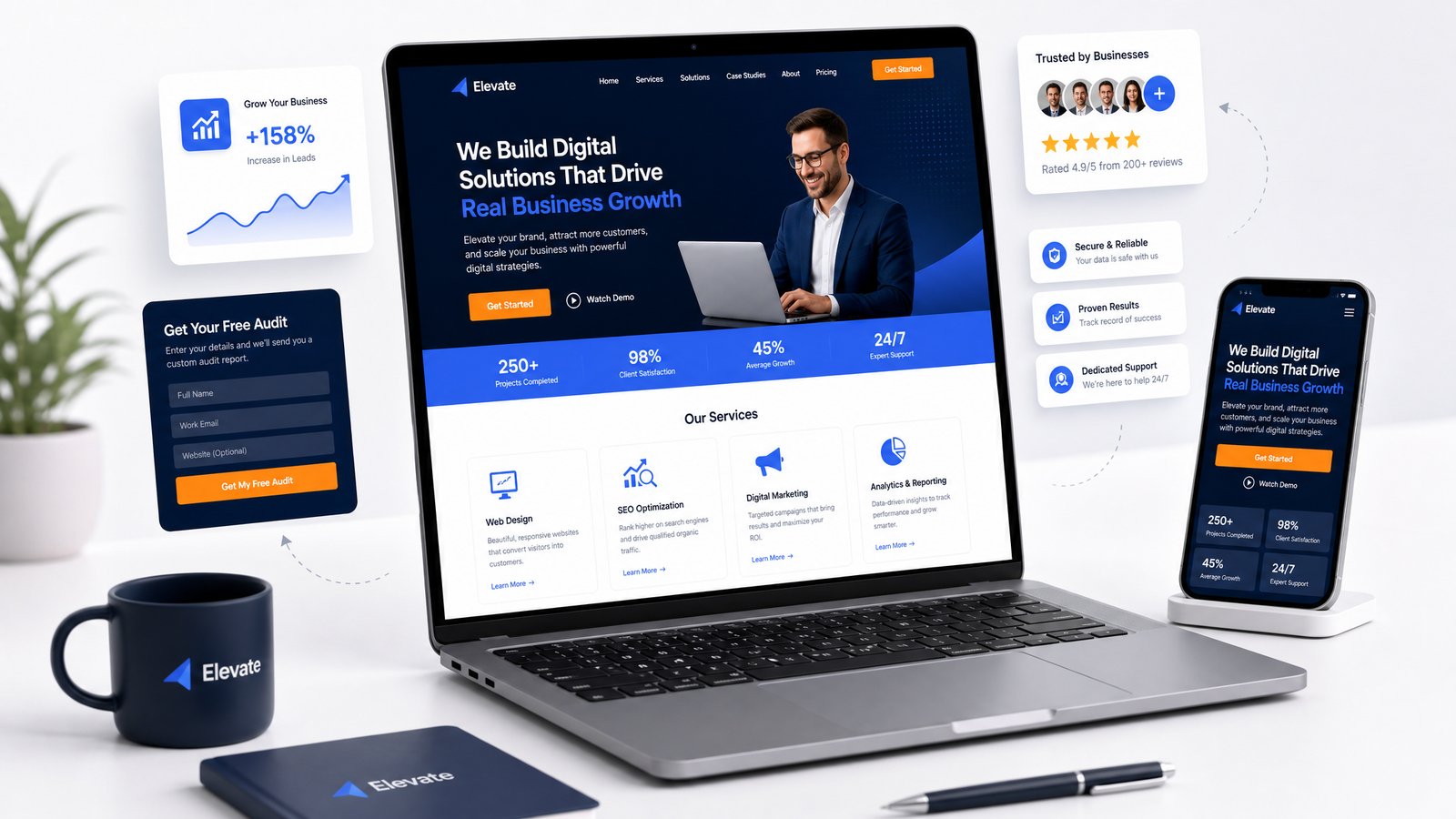
Conversion-Focused Design: Turning Visitors Into Leads
This is where the rubber meets the road. A beautiful website that doesn't convert is like a fancy restaurant with terrible food. It's theater, not business.
Call-to-Action: The Most Important Element on Your Page
Every page on your website should have one primary goal. One thing you want the visitor to do. That's your primary call-to-action (CTA).
Your CTA needs to be:
- Visible without scrolling — At least the top of your CTA should be visible above the fold.
- Action-oriented — Not "Submit" or "Learn More." Try "Get Your Free Quote" or "Book a Call With Our Team."
- Benefit-focused — Tell them what they get. "Get Your Free Website Audit" is more compelling than "Contact Us."
- High contrast — Your CTA button should stand out. If your website uses blue as a primary color, your CTA button should use your accent color (orange, in VidyaSaaS's case) to draw the eye.
Put CTAs strategically throughout the page, not just at the bottom. After a compelling statistic? Add a CTA. After explaining a key benefit? Add a CTA. After a testimonial? Add a CTA.
Forms That Don't Scare People Away
Your contact form is a conversion tool, not a security checkpoint. If you're asking for someone's phone number, full address, company size, annual revenue, and a description of their problem in 500 characters, you're asking too much.
The rule of thumb: For initial contact, ask for no more than three fields. Name, email, and a brief message. You can collect more information later, after they've engaged with you.
If you must have more fields, show a progress bar. People are more likely to complete a multi-step form if they can see how close they are to finishing.
Trust Signals: The Reason People Say Yes
Before someone fills out your form or calls your number, they need to trust you. Trust signals are the things that tell them, "These guys are legit."
Effective trust signals include:
- Client logos — Real companies you've worked with. If you have big names, feature them prominently.
- Testimonials — Not generic "Great service!" quotes, but specific results. "VidyaSaaS helped us increase leads by 300% in three months" is powerful.
- Case studies — Detailed breakdowns of problems you solved.
- Certifications and awards — Google Partner badge, industry awards, media features.
- Real contact information — Physical address, phone number, and email. A Gmail-only contact looks suspicious.
- Social proof numbers — "2000+ clients served," "₹50M+ revenue generated for clients."
Position trust signals where they matter most: near your CTAs, on your service pages, and prominently on your homepage.
Social Proof: The Indian Consumer's Shortcut
Indian consumers, in particular, rely heavily on social proof. We ask our friends for recommendations. We check Google reviews before trying a new restaurant. We look for "people also bought" on ecommerce sites.
Use this psychology on your website. Add testimonials that feel real — use full names, photos, and specific results. A testimonial that says "They did great work" is forgettable. One that says "Rahul from Delhi saw a 40% increase in enquiries within two months of redesigning his website" is compelling.
Page-by-Page Best Practices
Different pages serve different purposes. Let's look at the key pages and what each needs to do.
Homepage: Your Digital Front Door
The homepage has one job: get people to the right next step. It's not meant to say everything about your business. It's a starting point.
Structure your homepage like this:
- Hero section — A clear headline stating what you do or the problem you solve. A supporting subheadline. One primary CTA button. No clutter.
- Social proof — Client logos or testimonials right below the hero.
- Value proposition — Why you? Three to four key points about what makes you different.
- Services overview — Brief summary of what you offer, with links to dedicated pages.
- Strong testimonials or case study preview — Real results from real clients.
- Final CTA — One last push. "Ready to grow your business? Let's talk."
That's it. Don't add a blog feed, a photo gallery, a live Instagram feed, or an animated brand story that takes thirty seconds to load. Keep it clean. Keep it focused.
About Page: Where Trust Deepens
The About page is often the second or third most visited page on a business website. People want to know who they're dealing with before they commit.
Don't make your About page a corporate history essay. Instead, answer three questions:
- Who are you? (Your team, your mission, your values)
- Why should they trust you? (Experience, credentials, past work)
- What's in it for them? (How your story connects to solving their problem)
Include real photos of your team. Stock photos of smiling people in suits feel fake. A real photo of your team in your actual office helps people feel like they know you.
Service Pages: Where Conversions Happen
Your service pages are your most important pages. This is where most of your organic traffic will land, and this is where people decide whether to contact you.
Each service page should include:
- Clear service name and description — What exactly do you offer?
- Benefits, not just features — Don't just say "we do SEO." Say "we help you rank on Google's first page so customers find you instead of your competitors."
- Process overview — How do you work? What should the client expect?
- Pricing (or pricing range) — If you can't show exact prices, give a range. "Starting from ₹X" is better than "Contact us for pricing."
- Client results — Case studies or testimonials for this specific service.
- FAQ — Address common objections before they're raised.
- Clear CTA — Book a consultation, get a quote, start now.
Contact Page: Remove All Friction
Your contact page should be dead simple. Include:
- Contact form (three fields max)
- Phone number (clickable on mobile)
- Email address (clickable)
- Physical address (with a map embed if relevant)
- Business hours
- Social media links
If you offer emergency or urgent services, say so. "Available 24/7 for urgent enquiries" builds trust.
Mobile-First Design: Non-Negotiable in 2026
If your website doesn't work perfectly on a mobile phone in 2026, you might as well not have a website. Over 75% of internet users in India access the web exclusively through their phones. Google uses mobile-first indexing, which means it primarily uses the mobile version of your site to determine rankings.
Mobile-first design means you start designing for the smallest screen and then expand to larger screens. Not the other way around. Most designers still design on a 27-inch monitor and then try to cram everything into a phone screen. That's backwards.
Key mobile considerations:
- Touch targets — Buttons and links should be at least 48 pixels tall. You'll be surprised how many sites have buttons so tiny that users tap the wrong thing.
- Font size — Body text should be at least 16 pixels on mobile. Anything smaller will have users pinching and zooming, which is a terrible experience.
- No hover dependency — Hover effects don't work on touch screens. Don't hide important information behind hover states.
- Compressed images — Use next-gen formats like WebP. Large images are the number one killer of mobile page speed.
- Sticky navigation — A simple sticky header with your phone number and a CTA button can dramatically increase conversions on mobile.
Speed as a Design Element
Page speed is not just a technical concern. It's a design concern. Every element you add to a page — images, scripts, animations, custom fonts — slows it down.
When we build websites at VidyaSaaS, we treat every kilobyte as a precious resource. Before adding any element, we ask: "Does this help convert visitors, or is it just decoration?"
Practical speed tips:
- Compress images aggressively (aim for under 100KB per image)
- Use lazy loading for images below the fold
- Minimize the use of custom fonts (one font family is usually enough)
- Remove unused CSS and JavaScript
- Use a content delivery network (CDN)
- Enable browser caching
- Consider static site generation for content-heavy pages
A one-second delay in page load time can reduce conversions by 7%. For a business that gets 10,000 monthly visitors, that's potentially hundreds of lost leads per year.
Design Trends 2026: What Actually Works
Let's cut through the trend noise. Not every design trend is worth following, especially for a business website that needs to convert.
Trends Worth Your Time
Minimalism with personality. Clean layouts with purposeful white space? Yes, always. But minimalism doesn't have to be boring. Use your brand colors strategically. Add a bold accent color for CTAs. Use typography as a design element.
Dark mode support. More users are browsing in dark mode, and offering a dark mode option shows you care about their comfort. It's not hard to implement and adds a premium feel.
Micro-interactions. Small animations that respond to user actions — a button that changes color on hover, a testimonial that fades in as you scroll — these add polish without slowing things down.
Custom illustrations over stock photos. Real photography is great. Custom illustrations that reflect your brand personality are even better. Generic stock photos of people shaking hands? Those are dead.
Trends to Skip
Over-the-top animations. Full-screen video backgrounds, parallax scrolling that makes content impossible to read, and auto-playing videos with sound. These look impressive in a portfolio but hurt conversions.
Cookie-cutter templates. Using a popular theme that thousands of other businesses use destroys your uniqueness. Yes, custom design costs more. It's worth it.
Complex mega-menus. If your navigation requires a user guide, simplify it.
How to Brief a Web Designer
If you're hiring a designer or an agency like VidyaSaaS, the quality of the output depends heavily on the quality of the brief. A good brief saves time, money, and frustration.
What Your Designer Needs From You
- Your business goals — Not "I need a website." But "I need to generate 50 qualified leads per month from B2B service pages."
- Your target audience — Who are they? What problems do they have? What language do they use?
- Your competitors — Share three to five competitor websites. Tell us what you like and don't like about each.
- Your brand materials — If you have a logo, color palette, fonts, or brand guidelines, share them. If not, the designer will need time to create them.
- Content — Provide actual copy, images, and information for each page. Don't expect the designer to write your content.
- Examples you love — Websites outside your industry that capture the feel you want. This helps designers understand your taste.
- Must-haves vs nice-to-haves — Be clear about what's essential and what can be deprioritized.
Red Flags in Designer Briefs
- "I'll know it when I see it" — You need more clarity.
- "Just make it look like this competitor's site" — Why not just use your competitor? Think about differentiation.
- "I want everything on one page" — That's usually a sign of unclear priorities.
A great designer will push back on things that won't work. If your designer says yes to everything, find a different partner.
📚 Related Articles You Might Like:
Conclusion
Your business website is not a decoration. It's your most important lead generation asset. Every pixel, every line of text, every button should serve the purpose of turning a visitor into a customer.
This isn't about technical complexity or fancy animations. It's about clarity, speed, trust, and a clear path forward. When you design with conversion in mind — when every element earns its place — your website stops being an expense and starts being an investment that pays for itself again and again.
At VidyaSaaS, we don't just build websites. We build conversion machines. Our web design process starts with understanding your business goals, your customers, and what actually drives them to take action. Over 2,000 businesses have trusted us to build their digital presence, and we'd love to help you do the same.
Ready to build a website that doesn't just look good but actually brings in leads? Contact VidyaSaaS today for a free consultation. Our team in Bhopal will help you design a conversion-focused website that your customers will love and your competitors will envy.
Want Results Like This?
Get a free digital marketing audit and custom growth plan for your business.
Get Free AuditVidyaSaaS Team
Super AdministratorPart of the VidyaSaaS team — a group of digital marketing strategists, content specialists, and growth experts helping businesses across India achieve measurable results through data-driven marketing.
More about our teamRelated Articles
Handpicked content to help you grow your business
Solapur Textile Town 2.0: Web Design and Digital Presence for Maharashtra Manufacturing Hub
Solapur towels and bed sheets supply hotels across India. Its textile mills run 24/7. But its websit...
Bhavnagar Port City Potential: Web Design and Digital Presence for Gujarat Diamond and Ship-Breaking Hub
Bhavnagar diamond polishers supply global markets. Alang ship-breakers recycle the world vessels. Bu...

Erode Turmeric to Textiles: Web Design That Sells for Tamil Nadu Agricultural Powerhouse
Erode turmeric sells in 40 countries. Its textile mills supply global brands. But most businesses he...
Ready to Grow Your Business?
Let's discuss how we can create a data-driven digital marketing strategy tailored to your goals.